YAMAOSM
企画編集執筆


2025年の大阪・関西万博で、国内外の方に大分県について知ってもらうためのブックレットです。私は、公募段階からの計画立案・提案書作成、冊子全体のディレクション・編集・執筆・進行管理を担いました。この規模での公募案件の個人での受託は、あまり例がないことかもしれません。万博終了後は、県内の旅行客が多い施設や県庁での来客対応など、大分を紹介する場面で幅広く活用されています。
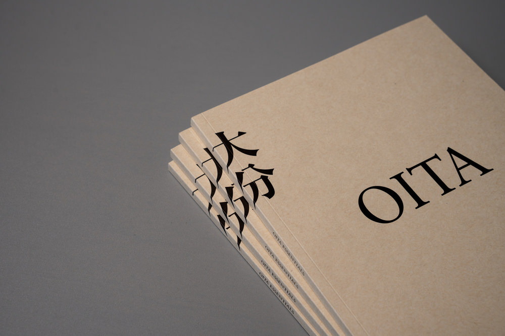
大分県の事業で、正式な事業名は「大分県地域資源素材集作成業務」。訪れるべき場所や観光ルートなどを提案しすぎず、手に取った人が自分なりの大分を発見できる余白を残すことも重要だと考えました。そこで、「ビジュアルブックのような資料集」をコンセプトに制作を進めました。
また、世界各地の情報があふれている会場においても耐えうる、端的さやビジュアルによる訴求を重視。長く手元に置いておきたくなるもの、本棚に置かれ、何年か経ってからまた手に取るような郷土史のような佇まいにしたいと考えました。
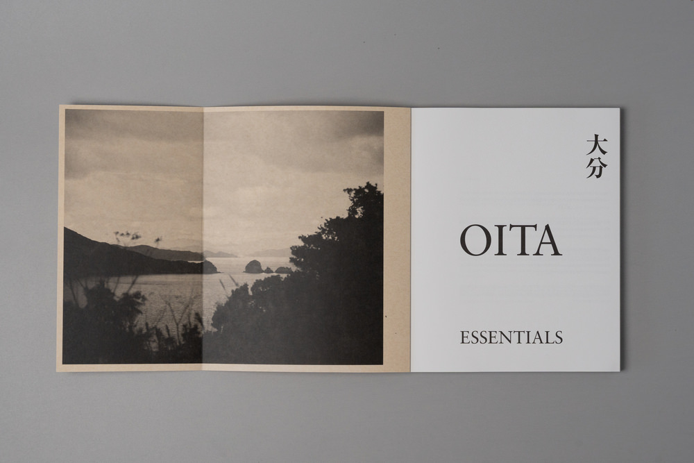
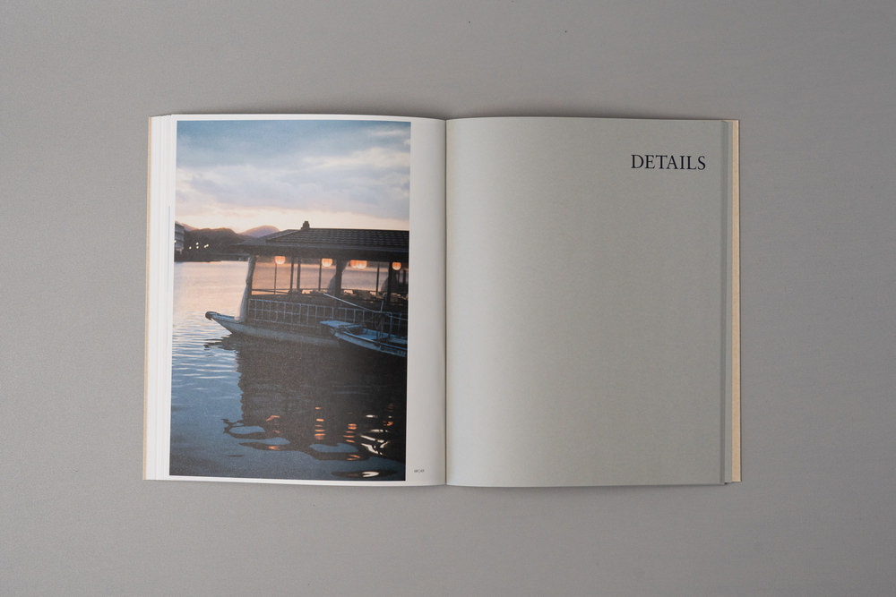
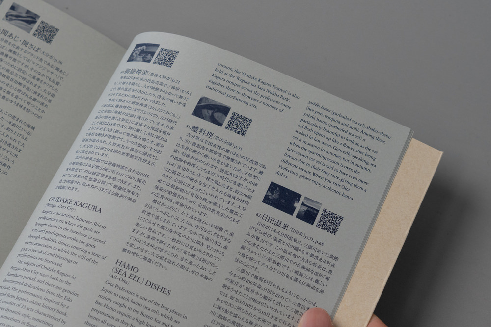
冊子の構成では、前半68ページは写真集のように展開し、後半32ページにサムネイルとテキストをまとめています。前半は直感的に「見る」、後半は気になった写真についてのテキストをじっくり「読む」という、行動のフェーズを分けた設計としています。また、写真はサイズや配置に緩急をつけ、資料的な単調さを回避し、ビジュアルブックとしての面白さを追求しました。テキストは、日英併記です。
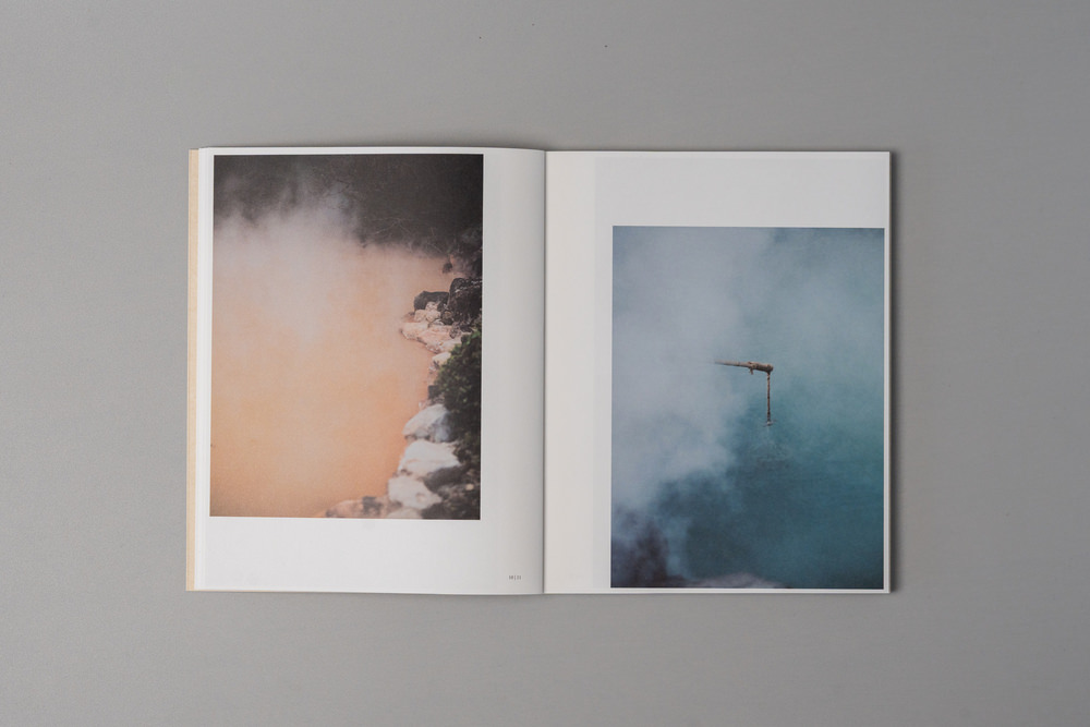
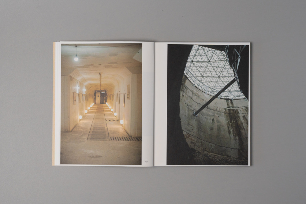
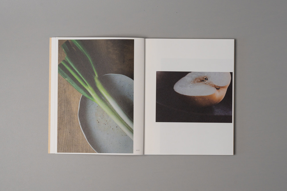
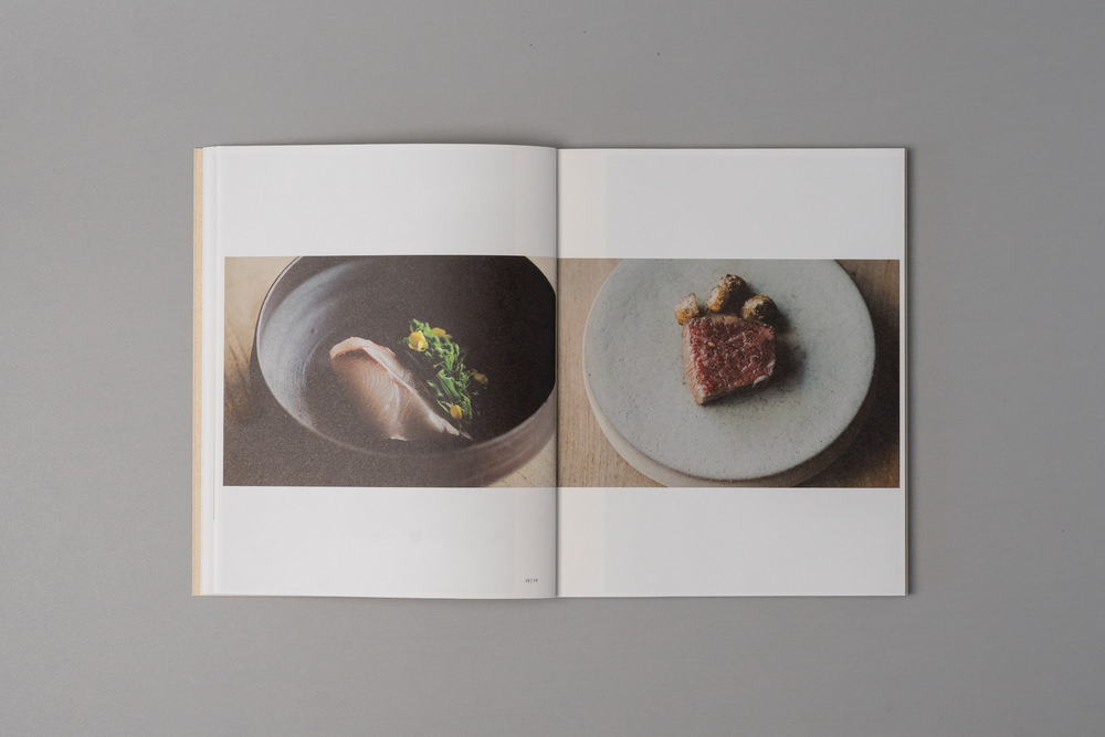
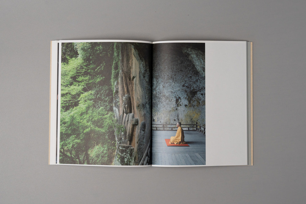
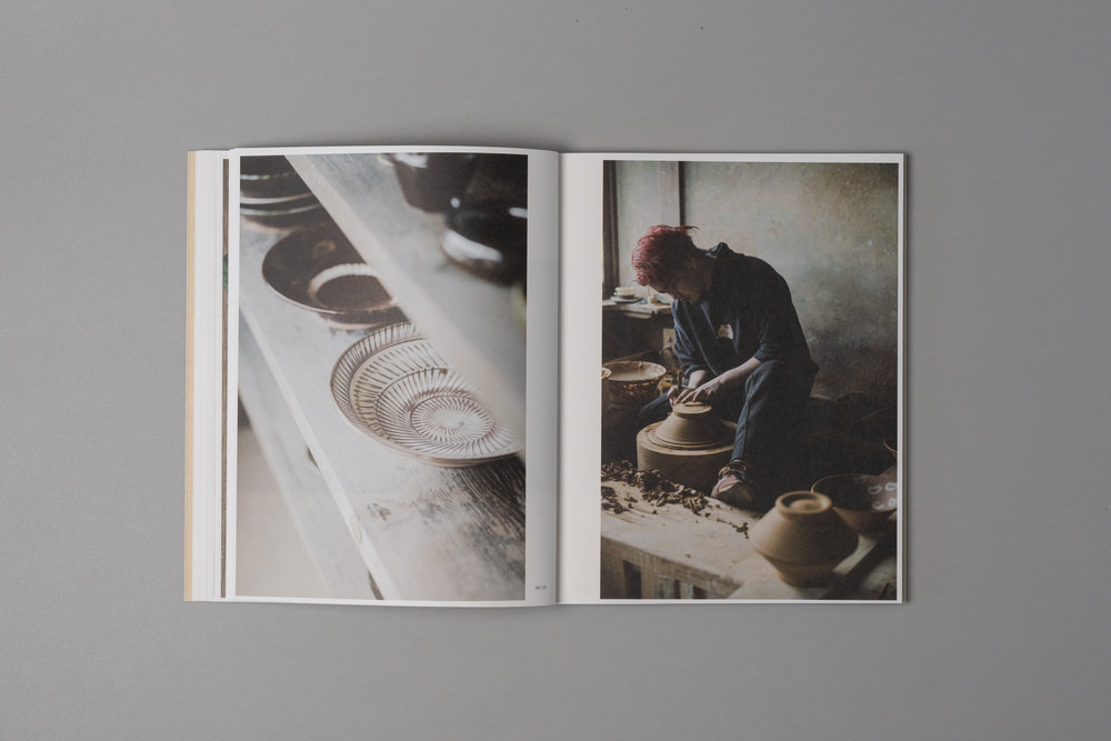
掲載する素材は、大分県が各市町村にアンケートをとって集めた「定番」がほとんど。県内の方の目に触れる機会も想定されていたため、地元の人が見ても「私が住んでいる場所って、こんなにいいところなんだ」と感じ直せるような写真にしたいと考えました。そこで、フォトグラファーによる新鮮な視点で撮影することを依頼。大分を知らない人には訪れてみたい場所に、大分を知っている人には誇りたい場所に。この冊子がそうした体験をもたらすものになることを目指しました。
Webサイトは、冊子の世界観をそのままサイトに落とし込んだ静的な構成で、冊子に掲載できなかったカットも収録しています。万博の展示会期中にモニター投影することが条件として求められていたため、トップページでは、写真がスライドのように切り替わる仕様になっています。コンテンツは「温泉・自然」「歴史・文化」「食」「その他」のカテゴリーに整理されており、各素材をシンプルに一覧できる設計です。余白を生かした落ち着いたレイアウトで、冊子と同様に「見る」ことに集中できる、静かな佇まいのサイトになっています。
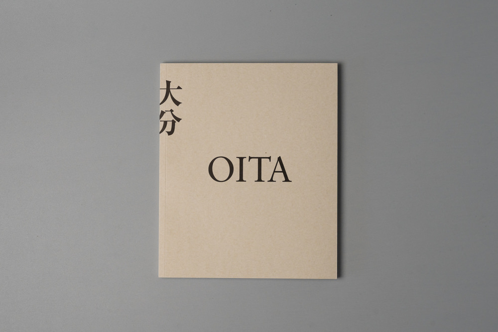
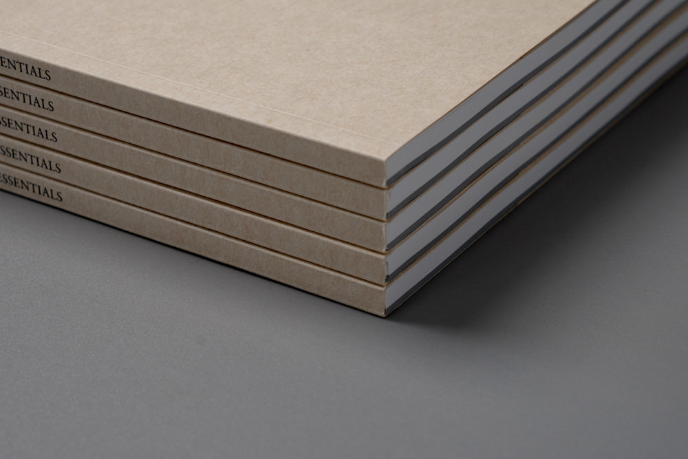
仕様:B5判/100P(前半68P カラー+後半32P 1色刷り)/無線綴じ/日英併記/5,000部
配布場所:2025年9月3日(水)~5日(金)大阪・関西万博会場内EXPOメッセ『WASSE』九州の宝を世界へ~Treasure lsland ・KYUSHU〜大分県ブース内。ほか、大分県内各所。
A booklet produced for the 2025 Osaka-Kansai Expo to introduce Oita Prefecture to visitors from Japan and abroad. I was responsible for planning and proposal writing from the public tender stage, through to the overall direction, editing, writing, and production management of the publication. Taking on a public tender project of this scale as an individual is, perhaps, uncommon. Since the Expo, the booklet has been put to wide use in settings where Oita is introduced to visitors — at facilities popular with tourists across the prefecture and at the prefectural government offices.
This was a project commissioned by Oita Prefecture, formally titled “Oita Regional Resource Materials Compilation.” Rather than prescribing places to visit or tourist routes, we wanted to leave room for readers to discover their own Oita — and with that in mind, developed the concept of “a reference collection in the form of a visual book.”
We also placed emphasis on immediacy and visual impact strong enough to hold its own in an expo environment saturated with information from around the world. The aim was to create something people would want to keep close — something with the quiet presence of a local history book, the kind that finds a place on a shelf and gets picked up again years later.
The booklet is structured in two halves: the first 68 pages unfold like a photography book, while the final 32 pages bring together thumbnails and text. The design separates two modes of engagement — the first half for instinctive looking, the second for reading carefully about whichever images caught your attention. Photographs vary in size and placement throughout, avoiding the monotony of a reference document and pursuing the visual interest of a photobook. Text is presented in both Japanese and English.
Almost all of the material featured was sourced from a survey Oita Prefecture conducted across its municipalities, the kind of well-known subjects that have been photographed many times over, with images similar to those already in wide circulation. Simply reproducing that would have had little meaning. Since the booklet was also expected to reach local residents, we wanted photographs that would prompt even people who live there to see their surroundings anew, to feel that the place they call home is somewhere genuinely worth being proud of. For that reason, we chose to work with a photographer whose fresh eye could reframe the familiar. For those who don’t know Oita, somewhere they want to visit. For those who do, somewhere they can take pride in. We hope the booklet offers something of both.
The website carries the world of the booklet directly into a static layout, and includes photographs that didn’t make it into the print edition. As a condition of the project, the site needed to be suitable for display on screens during the Expo, so the top page features a slideshow of photographs cycling through in sequence. Content is organized into four categories — hot springs and nature, history and culture, food, and other — allowing visitors to browse the material at a glance. With generous use of white space and a calm, unhurried layout, the site shares the booklet’s quiet presence: a place to simply look.
Specifications: B5 / 100 pages (68pp color + 32pp single color) / perfect binding / bilingual Japanese-English / 5,000 copies
Distribution: Oita Prefecture Booth, “Treasure Island KYUSHU” zone, EXPO Messe “WASSE,” Osaka-Kansai World Expo, September 3–5, 2025. Also distributed at various locations throughout Oita Prefecture.


