YAMAOSM
企画編集執筆


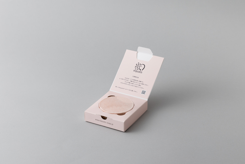
洗顔石鹸ブランド「equals(イコールズ)」の商品リニューアルにあたり、Webサイト・パッケージ・リーフレットの編集・執筆、コピー作成を担当しました。
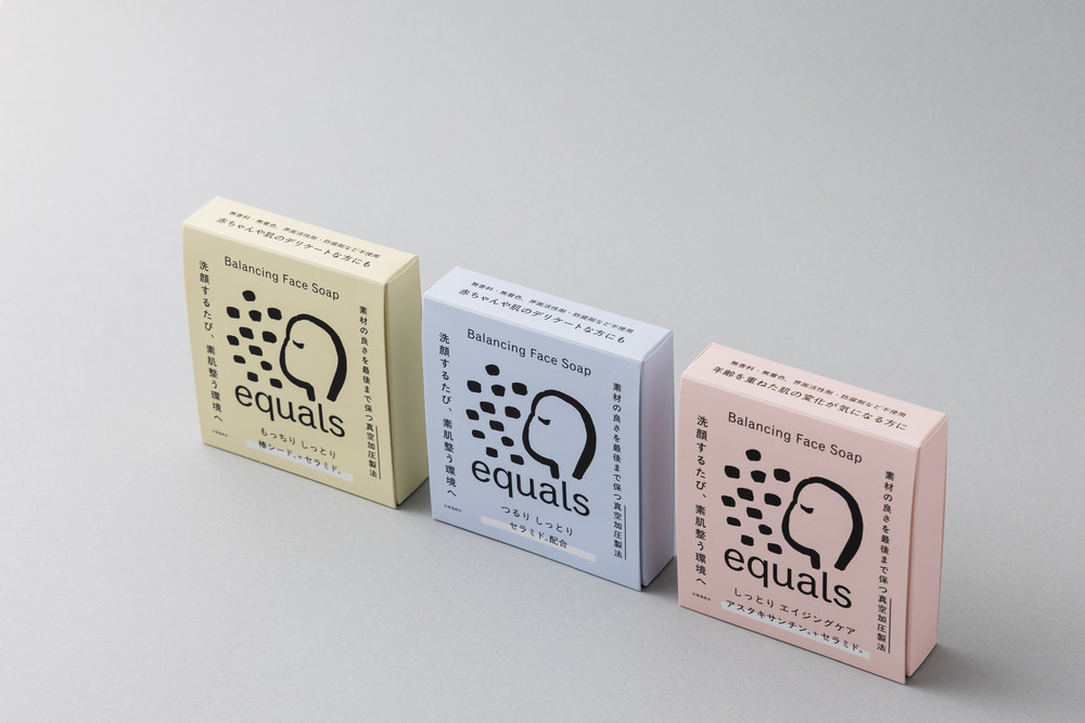
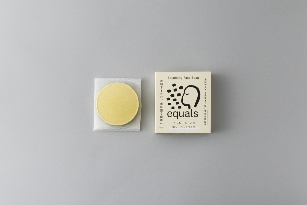
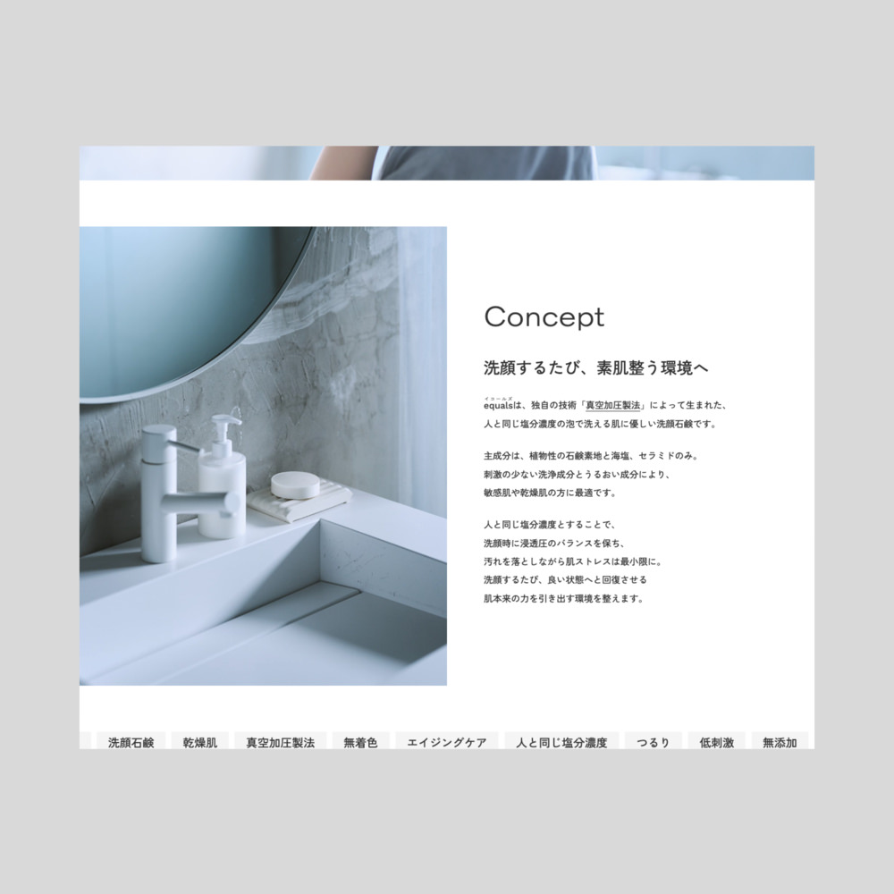
equalsは、佐賀県みやき町にある株式会社ロイスが手がける洗顔石鹸です。同社独自の技術「真空加圧製法」によって生まれた、人と同じ塩分濃度(約0.9%)の泡で洗える、肌に優しい洗顔石鹸です。洗顔時に肌の浸透圧のバランスを保ち、汚れを落としながら肌ストレスを最小限に抑えます。洗顔するたびに、肌が本来持っている回復力を引き出す環境を整えてくれます。
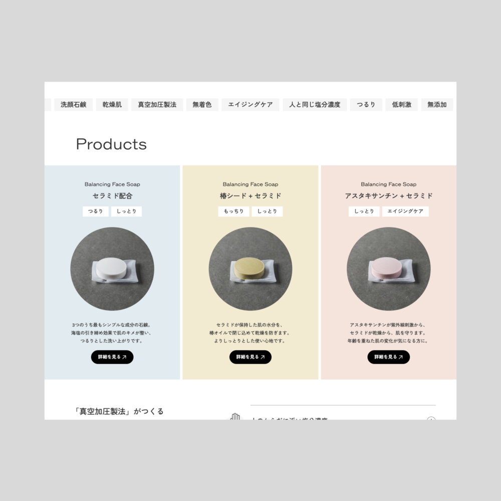
リニューアル以前、同社はOEMに強みを持ち、独自の技術力を活かしながら各社からの依頼を受けてオリジナル石鹸を製造していました。同時に自社商品「塩せっけん|お塩のめぐみ」を販売していましたが、今回のリニューアルでは自社ブランドのさらなる強化を目標に、商品名をequalsに改め、セラミドを新たに配合し、価格設定も見直しました。
ブランド名「equals」は、泡立てたときに人のからだと同じ塩分濃度(約0.9%)になることに由来しています。末尾の「s」をつけたのは、本来の等しいという意味はもちろんのこと、赤ちゃんやデリケートな肌の方など、さまざまな人の肌状態に寄り添いたいという思いが込められています。
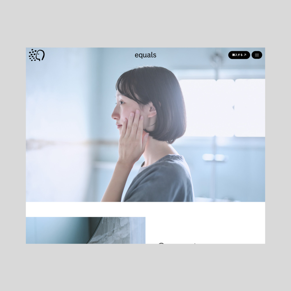
Webサイトはビジュアルを主軸に、直感的にブランドの印象が伝わるシンプルな構成としながら、ロゴやボタンのモーションでブランドの世界観や質感を豊かに表現することを目指しました。モーションロゴでは「=」がブランドのロゴマークへと移り変わる仕掛けを取り入れ、equalsの石鹸を使ったときのつるりとした質感を滑らかなアニメーションで表現しています。
I worked on the editing and writing, copywriting for the website, packaging and leaflet text for the rebranding of equals, a facial soap brand.
equals is a facial soap made by Royce Co., Ltd., based in Miyaki Town, Saga Prefecture. Developed using the company’s proprietary “vacuum pressure method,” it produces a lather with the same salt concentration as the human body (approximately 0.9%), making it exceptionally gentle on the skin. During cleansing, it maintains the skin’s osmotic balance——removing impurities while keeping stress on the skin to a minimum. With each wash, it helps create the conditions for the skin to draw on its own natural ability to recover and restore itself.
Before the rebrand, Royce had built its reputation primarily in OEM manufacturing, producing original soaps for various clients while leveraging its distinctive technical expertise. Alongside this, the company had been selling its own product under the name “Salt Soap | The Gift of Salt.” The rebranding marked a shift toward strengthening the company’s own brand: the product was relaunched as equals, reformulated with the addition of ceramide, and repriced accordingly.
The name “equals” comes from the fact that when lathered, the soap produces foam with the same salt concentration as the human body (approximately 0.9%). The plural “s” carries a double meaning: beyond the literal sense of equivalence, it reflects a wish for the soap to adapt to and care for the skin of all kinds of users——from babies to those with sensitive or delicate skin.
The website was designed around visuals, with a clean and intuitive layout that communicates the brand’s identity at a glance. At the same time, motion design in the logo and buttons was used to enrich the expression of the brand’s world and tactile quality. The motion logo features a transition from the “=” symbol into the brand mark, rendered as a smooth animation that evokes the silky, gliding sensation of using the soap.


